| Signal | Figure |
|---|---|
| Global mobile OS share (July 2026) | Android 68.36%, iOS 31.6% |
| US mobile OS share (July 2026) | iOS leads at 59.58% |
| Consumer app spend | iOS captures about 64% |
| Large-screen Android devices in use | 580 million+ |
Here's a quick test. Open the same app on an iPhone and on a Pixel, side by side. If the two screens match pixel for pixel, the designers probably got something wrong.
That sounds backwards, so let's rewind a year. iOS 26 reached iPhones on September 15, 2025, and tab bars across the platform turned into floating glass. That same month, Google started rolling Material 3 Expressive out to Pixel phones, with more animation and bolder color.
Both platforms were redesigned within weeks of each other, and they went in very different directions. Apps that looked identical on both suddenly looked a little lost on one of them.
Now it's September 2026, and the stakes are higher. iOS 27 is rolling out this month, and apps built with its SDK can no longer switch off the glass look. On Android, apps targeting Android 17 can't lock themselves to portrait on large screens anymore. If you're planning an app for both stores, the cross platform app design choices you make in the first few weeks will shape a lot of your rework bill later.
Where things stand in September 2026
| Signal | Figure |
|---|---|
| Global mobile OS share (July 2026) | Android 68.36%, iOS 31.6% |
| US mobile OS share (July 2026) | iOS leads at 59.58% |
| Consumer app spend | iOS captures about 64% |
| Large-screen Android devices in use | 580 million+ |
In plain terms, Android brings the reach and iOS brings much of the revenue. You need both, and you need each one to feel right.
Sources: StatCounter via SQ Magazine, Digital Applied, Android Developers Blog
What you get when this is done well:
Think of the app in two layers:
| Layer | What lives here | Shared or split? |
|---|---|---|
| Brand and content | Screens, copy, colors, illustrations, business logic | Shared |
| Platform shell | Navigation, back behavior, dialogs, pickers, sharing, permissions | Split per platform |
The hard part is agreeing where that line sits before engineering starts building screens. Moving it later means redoing work.
Most product teams have this argument. The smart ones have it in week one.
For games, media players, and heavily branded retail apps, customers often expect the brand to lead the experience.
Your users arrive with years of muscle memory. An Android user hits the system back button and expects to go back. An iPhone user swipes in from the left edge for the same result.
When your app ignores those habits, people feel the friction even if they can't explain it. They decide the app feels "off," and that feeling shows up in your ratings.
| Approach | Shared | Adapted per platform | Good fit |
|---|---|---|---|
| Pixel-identical | Everything | Nothing | Games, branded media, kiosk apps |
| Hybrid (our default) | Brand, content, core flows, most components | Navigation shell, back behavior, dialogs, pickers, sharing | Retail, fintech, health, SaaS, marketplaces |
| Fully native look | Logic and data | Most of the UI | Apps that should feel like built-in system tools |
The two platforms have drifted further apart over the last year. Here's a cheat sheet of the iOS vs Android design differences that matter most when one app has to work on both.
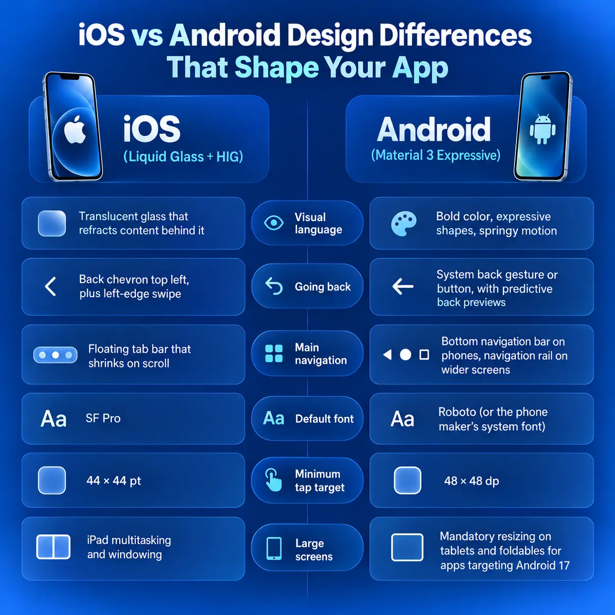
Android has a system-wide back action, and Google keeps building on it.
iOS has no system back button, so every pushed screen needs its own visible way out.
| Pattern | iOS | Android |
|---|---|---|
| Critical choice | Centered alert | Dialog with right-aligned text buttons |
| List of options | Action sheet from the bottom | Bottom sheet |
| Quick "undo" message | No direct equivalent | Snackbar |
| Denied permission | Usually gone for good; user must visit Settings | Can ask again, until the system stops showing the prompt |
The permission row matters more than it looks. On iOS you get one real shot, so a short "here's why we need this" screen before the system prompt carries a lot of weight.
Android keeps adding permissions, too. Android 17 introduced ACCESS_LOCAL_NETWORK, a new runtime permission that gates device discovery, casting, and local network scanning. If your app talks to printers, TVs, or smart home gear, design that flow now so it doesn't surprise you in QA.
These don't change between platforms. Treat them as fixed.
Naming trips up more teams than you'd expect. If the iOS app says "Saved" and the Android app says "Favorites," your support docs and marketing emails now need two versions of every sentence. Pick one word and use it everywhere.
Households mix devices, and people switch phones. Someone who moves from an iPhone to a Pixel, or checks an order on a partner's phone, should find everything where they left it.
Matching flows also keep your analytics honest. When funnel steps are identical on both platforms, a conversion drop on one of them points to a real problem instead of a design difference. For the retention side, see our guide on why an app isn't getting downloads and how to fix it, plus this mobile app growth case study.
Adapting costs effort, so spend it where users notice.
| Area | Do this | Skip this |
|---|---|---|
| Gestures | Keep iOS edge-swipe back on every pushed screen and let Android predictive back animate | Custom swipe actions that fight system gestures |
| Sharing | Call each platform's native share sheet | A custom share menu that hides users' pinned contacts |
| Notifications | Design Android notification channels as part of the product; use iOS interruption levels and Live Activities | One generic notification style for both platforms |
One broken expectation is forgivable. Ten of them in one session add up to an app that feels clumsy, and clumsy apps get uninstalled.
The usual suspects in the apps we audit:
A design system is the shared library of components, styles, and rules your app is built from. In cross platform work, it decides whether your two apps stay in sync or slowly drift apart.
| Without a design system | With one |
|---|---|
| Every new screen gets debated from scratch | New screens are assembled from tested parts |
| A rebrand means redesigning the app | A rebrand is mostly a token update |
| iOS and Android drift apart release by release | Both stay aligned by default |
| New hires learn by asking around | New hires learn from documented rules |
Our UI/UX design team usually builds this foundation before the first feature screen, and it pays back quickly once the backlog gets moving.
Design tokens are named values for color, type, spacing, radius, and motion. Designers define them once in Figma Variables, and Style Dictionary exports them to Swift, Kotlin, Dart, or JavaScript. The W3C Design Tokens Community Group maintains the shared file format most tools now read.
What makes this work across platforms is naming tokens by purpose and letting each platform map them:
| Token | iOS maps to | Android maps to |
|---|---|---|
| color.surface.nav | Liquid Glass material | Surface container color |
| radius.card | 16 | 16 |
| motion.enter | Standard iOS spring | Material 3 Expressive spring |
| type.body | SF Pro, Dynamic Type Body | Roboto, Body Large |
Brand tokens stay identical across both apps. Feel tokens map to each platform's own values.
Your framework decides how much native behavior you get for free and how much you build yourself. After both platform redesigns, that gap matters more than it did in 2024.
| Flutter | React Native | Kotlin Multiplatform | |
|---|---|---|---|
| How it draws UI | Renders its own pixels | Wraps real native components | Shares logic; UI can be native or Compose Multiplatform |
| Default feel | Identical on both platforms | Native on each platform | Your choice |
| Liquid Glass today | Community packages; official Cupertino work moving to separate packages | Open-source native wrappers | Native if you use SwiftUI on iOS |
| Market signal (July 2026) | About 177,900 GitHub stars vs React Native's 126,242 | Present in more top-grossing apps; 10M+ weekly npm downloads | Growing, smaller ecosystem |
| VT service | Flutter app development | React Native app development | Cross-platform app development |
Market data: Quash, Flutter vs React Native statistics 2026
Flutter is the natural pick here. It draws every pixel itself, so your brand looks exactly the same on every device.
The catch shows up when Apple or Google redesigns. The Flutter team held off on building Apple's new design into the core Cupertino library while it rethought how design systems plug into the framework. In August 2026, Flutter 3.47 shipped the standalone material_ui and cupertino_ui packages at version 1.0, with the old bundled imports due for deprecation in the fall stable release (Flutter blog).
React Native renders real platform components, so many system changes arrive when you rebuild. Glass effects came through open-source libraries:
Those fallbacks carry a design lesson. Every glass surface in your file needs a solid-color backup style for older iPhones and for Android.
If platform feel outweighs everything else, it's worth pricing fully native iOS and Android builds alongside the cross platform option.
Figma shows you a perfect phone in perfect light. Your users have cracked screens, huge font settings, and five-year-old Androids.
One stat explains why the Android test matrix is always bigger. Twelve months after release, iOS 18 ran on 84.2% of active iPhones, while Android 15 was on 38.7% of Android devices (Digital Applied).
| What to test | What tends to break |
|---|---|
| Liquid Glass legibility | Text disappears over busy photos. iOS 27 lowered default transparency and added a slider between clear and tinted glass, so test both ends. |
| Tablets and foldables | Portrait-locked phone layouts stretch awkwardly once Android 17 removes the opt-out on large screens |
| Maximum font size | Clipped buttons and overlapping labels |
| Notch, Dynamic Island, gesture bar | Content hidden behind system UI on edge-to-edge screens |
| Budget Android phones | Blur and glass effects drop frames |
| Dark mode and right-to-left languages | Hard-coded colors and mirrored layouts |
A structured QA and software testing pass on real hardware catches most of this before your reviewers do. For the long tail of Android models, cloud device labs like Firebase Test Lab fill the gaps.
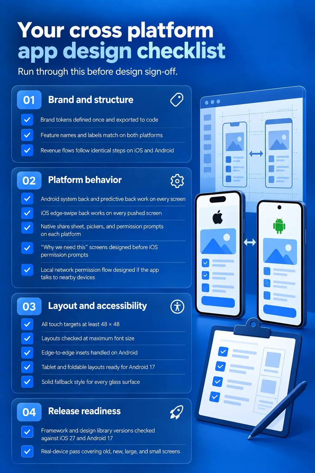
Three platform requirements belong on every mobile roadmap right now:
| Platform | Requirement | Date |
|---|---|---|
| iOS | Apps must be built with Xcode 26 and the iOS 26 SDK | In force since April 28, 2026 |
| iOS | Building with the iOS 27 SDK ignores the flag that kept the old design | Applies when you move to Xcode 27 |
| Android | New apps and updates must target API level 37, which makes resizing mandatory | August 2027 |
Sources: ecorpit, Android Developers Blog
| Shared work saves you money | Custom platform work earns its cost |
|---|---|
| Business logic, APIs, data layer | Navigation shell and back behavior |
| Most screens and components | Home screen widgets and Live Activities |
| Design system and brand assets | Camera, AR, heavy media |
| Analytics, CI/CD, most QA | Watch and car companion apps |
| Most bug fixes and feature updates | Signature visual effects like glass surfaces |
Budget a little extra time up front for the design system. It usually earns that time back within a few features, and it keeps paying off every time Apple or Google redesigns.
For real numbers on the iOS side, our iOS app cost budgeting guide for 2026 breaks down MVP, mid-level, and enterprise ranges. If you want to test the idea before a full build, start with MVP development.
Our cross platform app development services take a project from the first token file through store launch with one team. If you'd rather hire cross platform app developers to extend your own team, we can staff Flutter and React Native engineers who are already working through this year's platform changes. For a live example, here's how we built GfK's cross-platform MyScan app with OCR.
Two years ago, cross platform design mostly meant picking a framework and shipping the same screens to both stores. The 2025 redesigns and this year's platform rules changed that. Apple and Google now expect apps to look and behave like they belong on their devices, and both have closed the opt-outs teams used to buy time.
If you take four things into your next planning meeting, make them these:
Get these right, and the app your customers open on a Pixel will feel as considered as the one on their iPhone. That's the standard they'll judge you by.
Open the same app on an iPhone and a Pixel. The brand and core tasks should be familiar, but the two screens do not need to match pixel for pixel. In this episode, we unpack where cross platform app design should stay consistent and where iOS and Android users expect different navigation, back gestures, dialogs, sharing, and permission prompts.
We also explore how Liquid Glass and Material 3 Expressive shape the interface, how design tokens keep both versions aligned, and what Flutter and React Native mean for the native feel. Finally, we cover the checks that matter before launch: accessible touch targets, readable layouts, glass fallbacks, and testing on real phones, tablets, and foldables.
VT Netzwelt is a cross platform app development company that designs and builds apps in Flutter and React Native for businesses in the US and worldwide.
Book a free 30-minute call and bring your product idea or your existing app. We'll show you where a shared design saves you money, where each platform needs its own touch, and what launching on both stores will take. You'll leave with a clear next step, whether or not you work with us.
Book a Free Consultation
They can. React Native uses real platform components, so it looks native out of the box. Flutter draws its own UI, so a native look depends on how carefully the team uses the Material and Cupertino packages.
Neither. Design the shared brand layer and core flows first, then design both platform shells at the same time. Porting from one platform to the other later is how apps end up feeling foreign on the second one.
Navigation and back behavior top the list, followed by dialogs, permissions, typography, and motion. In 2026 the visual languages differ more than ever, with Liquid Glass on iOS and Material 3 Expressive on Android.
Yes. React Native apps get glass effects through native wrapper libraries. Flutter apps rely on community packages or custom widgets for now. Either way, you’ll need a solid fallback style for older iPhones and for Android.
Flutter suits pixel-identical, brand-heavy interfaces. React Native suits apps that should feel native on each platform. The deciding factor is how much platform-specific behavior your product needs.
Ask to see apps they’ve shipped on both stores, then open those apps on your own phones. Check whether the team builds a design system before feature screens, and whether they test on real budget Android hardware as well as flagship phones. A good partner should also be able to explain how they’re handling the Flutter package migration and iOS 27’s glass changes.

Are You Prepared for Digital Transformation?
Mobile App Development
Compare build, SaaS, and white-label ride-hailing software by 5-year TCO, control, compliance, data ownership, and exit risk to choose the right model.

Mobile App Development
Planning a ride hailing app? Get 2026 cost ranges, tech stack, and a clear step by step launch plan. Know when to buy white label or build custom.

Cross-platform App Development
Compare native vs cross-platform app development in 2026. See how AI coding agents affect cost, performance, code review, React Native, Flutter and KMP.